

Color affects decisions before people have time to explain their decision.
A red button won’t always beat a green button. Blue won’t automatically create trust. Black won’t make every brand feel luxurious. Those are the shortcuts that made color psychology popular, but they’re also why so much advice on the topic is weak.
Color works because people use visual cues to make fast judgments. A color can make something feel energetic, calm, cheap, premium, safe, urgent, natural, strong, playful, or unfamiliar. It can help someone notice the right thing first. It can make a product feel stronger, a brand feel more competent, or a page feel easier to understand.
But color doesn’t work alone. It works with context, culture, category expectations, contrast, typography, imagery, layout, product type, and the decision the person is trying to make. The same red that can raise attention on a sale page can feel aggressive in a healthcare form. The same blue that can support trust in finance can feel cold on a wellness brand. The same green that can signal nature in one market can signal money in another.
If you’re choosing colors for a brand, website, landing page, product, package, ad, or call to action, the useful question isn’t “what does this color mean?” The useful question is: “What decision do I want this color to support?”
Color psychology works, but not like most color charts claim
Color psychology is the study of how color affects perception, emotion, cognition, and behavior. In marketing and design, it usually asks a practical question: how do colors influence what people notice, trust, remember, click, compare, or buy?
The evidence says color can influence decisions. The catch is that color effects are usually context-dependent.
A widely cited 2006 marketing paper by Satyendra Singh argued that people can form an initial assessment of a product or person within 90 seconds, with a large share of that quick assessment tied to color. Treat that as a first-impression finding, not as proof that color controls every purchase.
The stronger lesson is this: color can dominate early perception when someone is quickly sizing something up. That early perception can affect whether they keep looking, feel comfortable, understand what matters, or trust the next step.
An Annual Review of Psychology paper by Andrew Elliot and Markus Maier makes the same broader point from the psychology side. Color can affect emotion, cognition, and behavior, but the research also needs careful attention to context, measurement, culture, and everyday use outside the lab. Color influences decisions, but it doesn’t do that through a universal cheat code.
Why color influences decisions
Color is one of the fastest signals your brain receives. Before someone reads the headline, compares the features, checks the price, or studies the offer, they already have a visual impression. That impression can influence decisions in a few ways.
First, color guides attention. High contrast pulls the eye. Bright colors can make one element stand out from a muted page. This is why a call-to-action button doesn’t need a “magic” color. It needs to be visually obvious in the context of the page.
Second, color creates expectation. A dark navy financial website, a pale green wellness package, a saturated orange discount badge, and a black luxury box all set different expectations before the customer reads a word.
Third, color supports categorization. People use color to decide what kind of thing they’re looking at. Is this playful or serious? Cheap or premium? Safe or risky? Natural or artificial? Modern or traditional?
Fourth, color can change perceived intensity. Recent marketing research has found that higher color saturation can make products feel more potent or effective. That can help when people want strength, but it can hurt when they want gentleness.
Finally, color works with memory. A consistent color system can make a brand easier to recognize across ads, packaging, social posts, emails, and website visits. The goal isn’t to use a color people “like” in isolation. The goal is to make the color help people identify and understand you faster.
For a deeper look at the psychology behind buying behavior, our guide to psychological factors in marketing covers the broader decision triggers that color often supports.
Color meanings aren’t universal
One of the biggest mistakes in color psychology is treating color meanings like dictionary definitions.
Red doesn’t simply mean urgency. Blue doesn’t simply mean trust. Green doesn’t simply mean nature. Purple doesn’t simply mean luxury.
Those associations can be useful, but they’re not fixed. A 2020 Psychological Science study tested color-emotion associations with 4,598 participants from 30 nations speaking 22 native languages. The researchers found broad universal patterns, but they also found local differences. Nation, language, and geography still shaped how people associated colors with emotions.
Stephen Palmer and Karen Schloss’s ecological valence theory helps explain why. People tend to prefer colors connected with things they like and dislike colors connected with things they dislike. That’s one reason the same hue can feel appealing, unpleasant, natural, artificial, safe, or risky depending on the object and setting around it.
This is why color advice has to be careful. Your audience’s culture, age, category, experiences, and expectations can change how a color lands.
If you sell to North American small businesses, green may suggest money, growth, nature, or approval depending on the context. If you sell food, green may suggest freshness. If you sell cybersecurity, green may support safety only if the rest of the brand feels serious enough. If you sell luxury, a bright green may feel too casual unless the whole identity makes it work. Color is meaning in context.
Confirmed color experiments and what they show
The strongest way to understand color psychology is to look at specific experiments, then ask what they prove and where the lesson stops. Here are the color studies and applied findings worth knowing.
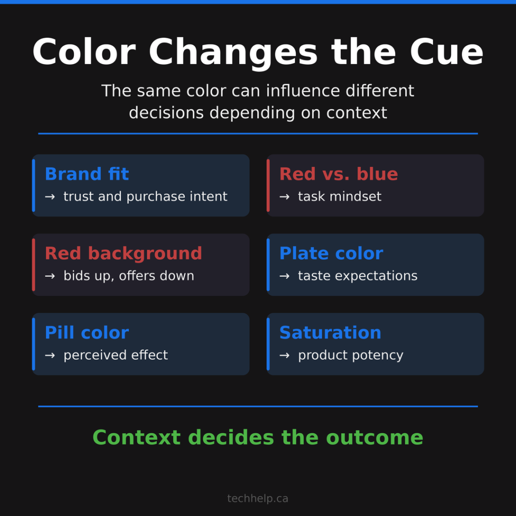
Color can shape brand personality
In “Exciting red and competent blue,” Lauren Labrecque and George Milne examined how color affects consumer perceptions across several studies. Their work connected colors to brand personality traits and showed that color can influence brand likability, familiarity, and purchase intent.
The useful part for businesses isn’t “use red” or “use blue.” The useful part is brand fit. Red can support excitement. Blue can support competence. Saturation and lightness can amplify or soften the signal. A color choice works better when it matches what the brand needs people to feel.
If your brand promise is stability, risk reduction, and reliability, a loud neon palette may fight the message. If your brand promise is energy, momentum, and appetite, a pale conservative palette may feel underpowered. Color should make the brand easier to believe.
Red and blue can change how people approach tasks
In a 2009 Science paper, Ravi Mehta and Rui Zhu studied how red and blue affected cognitive task performance. Red was linked with avoidance motivation and stronger performance on detail-oriented tasks. Blue was linked with approach motivation and stronger performance on creative tasks.
The researchers also tested product design and persuasive message evaluation, so the lesson travels well into marketing.
If a person needs to check details, avoid mistakes, compare technical information, or notice risk, a red cue can fit the task. If a person needs to imagine possibilities, explore ideas, or think expansively, a blue environment may support that mindset.
This doesn’t mean every detail page should be red or every creative product should be blue. It means color can nudge the mental mode people bring to the task.
Red can raise bids in auctions and lower offers in negotiations
Rajesh Bagchi and Amar Cheema studied red backgrounds in auctions and negotiations. Their research found that red, compared with blue, increased bid jumps in auction settings, but decreased price offers in negotiation settings. That’s a useful warning for marketers.
The same color can push behavior in opposite directions depending on the buying mechanism. In an auction, red may intensify competition against other bidders. In a negotiation, red may intensify the desire to push back against the seller.
If you’re designing a pricing page, bid flow, checkout, comparison table, or offer page, color should match the behavior you want. “More urgency” isn’t always better. Sometimes calmer decision conditions create more trust and a better sale.
Plate color can change how food tastes
In a 2012 Food Quality and Preference study, researchers served identical strawberry mousse desserts on black and white plates. The color of the plate influenced how people perceived the dessert. When served on a white plate, the mousse was rated as more intense, sweeter, and more liked.
This is why restaurants, food brands, recipe sites, product photography teams, and packaging designers care so much about the surface around the product.
People don’t experience the product in isolation. They experience contrast, container, background, lighting, expectation, and category cues. A product photo can make the same food feel fresher, richer, sweeter, lighter, or less appealing before taste enters the picture.
Pill color can affect perceived drug action
A BMJ systematic review looked at the color of drugs and placebo effects. It found that red, yellow, and orange were associated with stimulant effects, while blue and green were associated with tranquilizing effects. The review also found that effectiveness findings were less consistent, which is an important caveat.
This is one of the clearest examples of expectation. People bring learned associations to the object. A hot-colored pill can feel like it should stimulate. A cool-colored pill can feel like it should calm.
For ethical marketers, the lesson isn’t to manipulate health claims. The lesson is to understand that packaging and product appearance can set expectations before the product is used.
Advertising colors can change how an ad feels
Gerald Gorn, Amitava Chattopadhyay, Tracey Yi, and Darren Dahl studied hue, chroma, and value in advertising. Their research found that higher value colors, meaning lighter colors, led to greater ad liking through feelings of relaxation. Higher chroma colors, meaning more vivid colors, increased excitement, which also affected ad liking.
This is where many brand teams get color wrong. They debate hue, but ignore saturation and lightness.
Two brands can both use blue and feel completely different. A pale blue can feel soft and calm. A saturated electric blue can feel energetic and technical. A dark navy can feel serious, corporate, or secure. The hue matters, but the shade does a lot of the emotional work.
Saturation can make products feel more potent
A 2025 Journal of Marketing article by Labrecque, Sohn, Seegebarth, and Ashley found that consumers infer greater product efficacy from higher color saturation. The research included seven lab experiments with 2,745 participants, a web scraping study, and a field experiment. For product teams, this connects color directly to product judgment.
If a customer wants something strong, high saturation may support the perception of potency. If the customer wants something gentle, high saturation can backfire. A highly saturated skincare product may feel powerful, but not soothing. A highly saturated disinfectant may feel effective. A highly saturated sleep aid may feel too stimulating. The decision isn’t “make it brighter.” The decision is “does strength or gentleness help the sale?”
Red can influence competition, but the effect is debated
In 2005, Russell Hill and Robert Barton published a Nature paper arguing that competitors wearing red had a higher probability of winning in certain combat sports. The finding became famous because it suggested that color could influence competitive outcomes, not only perception.
Later research made the picture more complicated. Work in other competitive settings, including UFC and Olympic taekwondo, has found that the effect can vary by context, methodology, and sport-specific factors.
This is a good example of how color psychology should be used. A finding can be interesting without becoming a universal rule. Red can signal dominance, intensity, and competition in some settings, but it doesn’t automatically make a product, brand, athlete, or button perform better.
The blue street light claim needs caution
The blue street light claim has been repeated for years, but it shouldn’t be presented as simple proof that blue light reduces crime.
Research on street lighting and crime exists, including work in the Glasgow area, but the stronger evidence is about improved lighting, safety perception, and environmental design. The color blue itself is harder to isolate from other factors, such as brightness, novelty, location, policing, reporting, and changes in how people use the area.
So the safer lesson is this: lighting can change how a place feels and how people behave in that place, but we shouldn’t turn the blue-light claim into a tidy cause-and-effect conclusion.
The seven colors of the rainbow in marketing and design
The seven-color structure is still useful, as long as we treat it as a practical starting point instead of a rigid rulebook.
These meanings aren’t universal, and each color can shift depending on saturation, lightness, category, culture, and surrounding design. Use the sections below as decision prompts.
Red
Red is the highest-arousal color in many design contexts. It can signal energy, urgency, danger, romance, heat, appetite, competition, and action.
That makes red useful when you need attention fast: limited-time offers, error states, warnings, sale tags, bold campaigns, spicy food, sports, entertainment, and high-energy brands.
Red also carries risk. In the wrong context, it can feel aggressive, stressful, cheap, or unsafe. If your product depends on calm trust, red may work better as a small accent than as the dominant brand color.
Use red when the decision needs energy. Be careful when the decision needs reassurance.
Orange
Orange sits between red’s intensity and yellow’s warmth. It can feel friendly, active, affordable, playful, social, and approachable.
This is why orange often works for food, community, education, events, creator brands, youth-oriented products, casual CTAs, and offers that need warmth without the pressure of red.
The downside is that orange can sometimes feel inexpensive or informal. That may be perfect for a value-driven offer, but wrong for a premium advisory firm, high-end financial product, or serious legal service.
Use orange when the decision should feel easy, warm, and active.
Yellow
Yellow is highly visible. It can signal optimism, caution, energy, sunshine, affordability, and attention.
Because yellow grabs attention, it works well as an accent. It can highlight alerts, labels, promotions, and important UI moments. It can also help a brand feel cheerful or youthful.
Too much yellow can become tiring, especially on screens. Yellow also needs careful contrast because pale yellow text or buttons can become hard to read quickly.
Use yellow to direct attention, not to carry the whole experience.
Green
Green often signals nature, growth, health, renewal, safety, money, approval, and progress. The exact meaning depends heavily on the category.
In food, wellness, environmental, outdoor, finance, and productivity contexts, green can support the right expectation quickly. A soft green may feel natural and calming. A saturated green may feel active and growth-oriented. A deep green can feel stable, wealthy, or premium.
Green can also feel generic in categories where everyone uses it. If every eco-friendly brand uses the same soft green, the color may support category recognition but weaken differentiation.
Use green when you want to support safety, nature, growth, or forward movement.
Blue
Blue is often associated with competence, calm, reliability, communication, security, and trust. It’s common in finance, healthcare, SaaS, consulting, insurance, government, and technology because it can lower perceived risk.
That strength is also the weakness.
Because blue is so common in serious categories, it can make a brand feel familiar but forgettable. A financial brand may benefit from blue because buyers want stability. A creative consumer brand may disappear if it chooses a safe blue without a sharper identity around it.
Use blue when the decision requires confidence, patience, or reduced risk. Add distinction through shade, contrast, typography, imagery, or voice.
Indigo
Indigo sits between blue and violet, so it often borrows from both. It can feel deep, thoughtful, serious, intuitive, premium, or slightly mysterious.
The research literature rarely treats indigo as its own major marketing category, so it is safer to think of it as a dark blue-purple family. That makes it useful for brands that want trust with more depth than standard blue, or creativity with more restraint than bright purple.
Indigo can work for education, strategy, analytics, spirituality, premium technology, and thought-leadership brands. It can also become too dark or heavy if the surrounding design lacks contrast and space.
Use indigo when you want depth, seriousness, and imagination in the same visual signal.
Violet and purple
Violet and purple often signal imagination, sophistication, creativity, spirituality, beauty, luxury, or difference. They can help a brand feel more distinctive because fewer mainstream business categories rely on purple as their default.
Purple can be useful for beauty, creative tools, premium services, wellness, education, and brands that want to feel imaginative without feeling childish.
The risk is that purple can become too soft, abstract, or theatrical if it doesn’t match the offer. A cybersecurity company using bright purple may stand out, but it still needs enough structure, proof, and contrast to feel trustworthy.
Use violet or purple when the decision should feel creative, premium, reflective, or different.
How businesses should choose colors
The wrong way to choose brand colors is to ask, “What is my favorite color?” The better way is to connect color to the decision you need the audience to make. This is where digital branding becomes more than a logo exercise. Your colors should support the way people understand your position, trust your offer, and remember you later.
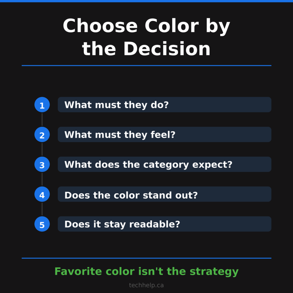
If people don’t trust you yet, your palette may need more stability, restraint, and contrast. If people understand you but ignore you, your palette may need more energy and distinction. If people click but don’t convert, your CTA may need better visual hierarchy, clearer copy, stronger contrast, or less competition around it.
Then choose colors by job:
| Decision job | Color question to ask |
|---|---|
| Get attention | Does this color stand out from the surrounding page or feed? |
| Build trust | Does the color support the level of seriousness the buyer needs? |
| Signal value | Does the palette feel premium, affordable, practical, or playful on purpose? |
| Reduce risk | Does the design feel readable, stable, and easy to understand? |
| Encourage action | Is the next step visually obvious without feeling pushy? |
| Strengthen memory | Will people recognize this color system across channels? |
Color is one part of user experience. If the page is confusing, slow, hard to read, or full of competing calls to action, color can’t rescue it.
The CTA color myth
One of the most common questions in color psychology is: what color button converts best?
The honest answer is that the best CTA color is the one that stands out, fits the brand, supports the action, and remains easy to read.
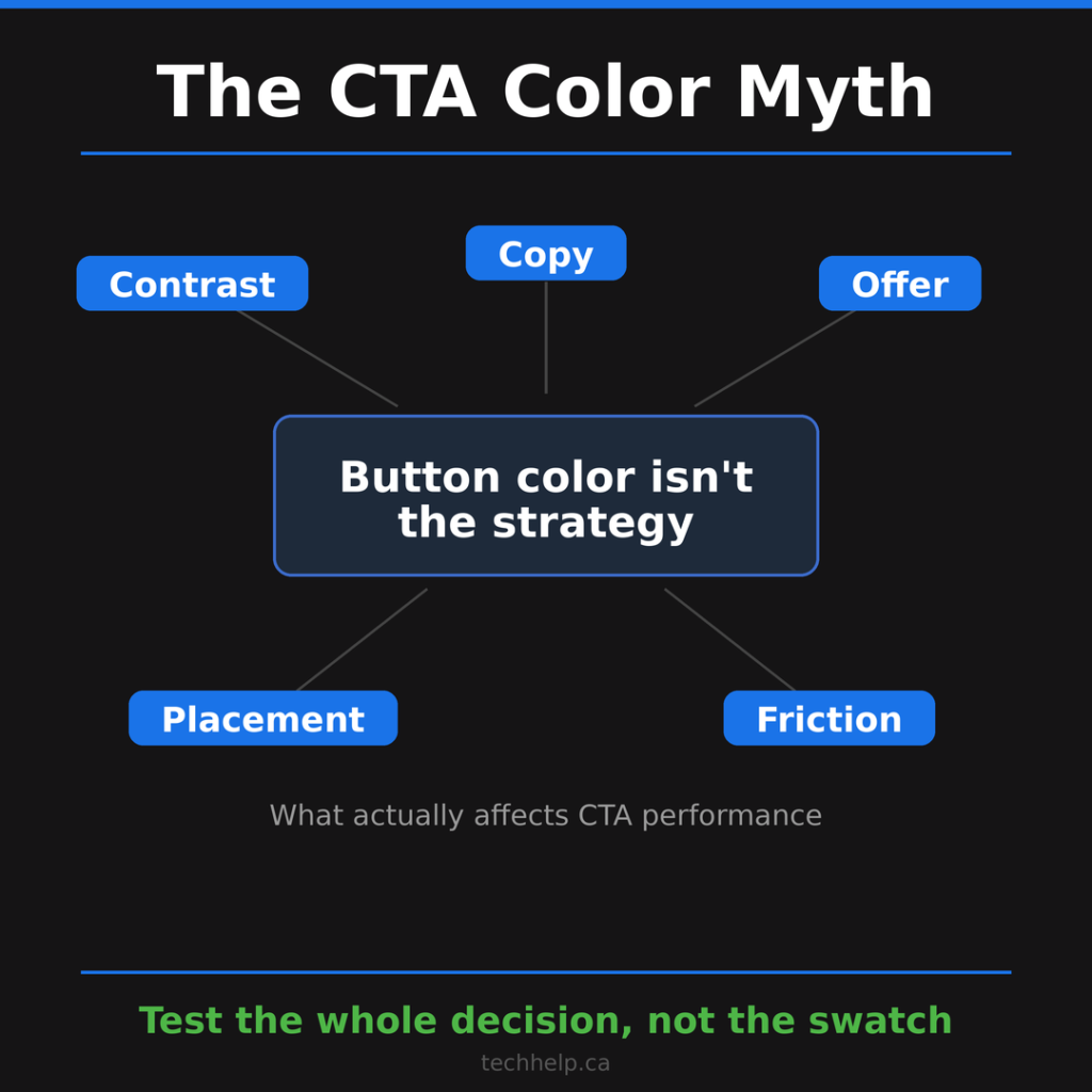
A red button can beat a green button on one page because it contrasts better. A green button can beat a red button on another page because it feels safer or matches the action. A black button can work beautifully on a minimal premium page. A blue button can work well if the rest of the page isn’t already blue.
Button color isn’t a conversion strategy by itself. The CTA also needs a clear offer, relevant placement, strong surrounding copy, low friction, and a reason to act. Our guide to effective CTAs goes deeper on the copy and placement side of that decision.
If you test CTA color, test it properly. Keep the copy, placement, page layout, traffic source, and offer stable. Otherwise, you may think color caused the result when something else changed.
Contrast beats color preference
People need to see, read, and understand the page before color psychology has any chance to help.
WCAG guidance recommends a contrast ratio of at least 4.5:1 for normal text and 3:1 for large text at Level AA. This isn’t only an accessibility issue. It’s a conversion issue.
Low-contrast text makes people work harder. Color-only instructions exclude people who don’t perceive color the same way. A beautiful palette that hides the button, weakens the headline, or makes form labels hard to read isn’t doing its job.
Use color to guide attention, but don’t rely on color alone. Pair it with clear labels, strong hierarchy, visible states, icons where useful, and spacing that makes the next step obvious.
A practical color testing framework
If you want color to influence decisions in a useful way, test it like a business decision, not a mood board.
First, define the decision. Are you trying to increase clicks, build trust, reduce hesitation, improve recall, make pricing easier to compare, increase perceived product strength, or make the page feel calmer?
Second, define the emotion or expectation that supports that decision. A visitor comparing cybersecurity services may need confidence. A visitor buying tickets may need excitement. A visitor choosing skincare may need gentleness. A visitor comparing project management tools may need clarity.
Third, choose the color role. You don’t need every brand color to do every job. One color may carry trust. One may carry action. One may carry warnings. One may carry background warmth. One may carry data visualization.
Fourth, test color in context. A swatch on a white background tells you almost nothing. Put the color in the page, ad, package, or email. Look at it beside the headline, product photo, form, pricing table, and CTA.
Fifth, check the experience on mobile. Many color decisions fail on smaller screens because contrast drops, buttons compete with other elements, or colorful sections become visually noisy.
Finally, document the rule. Your team should know what each color is for. If every designer, developer, marketer, and contractor uses colors differently, the palette stops signaling anything.
What color should your business use?
There’s no single best color for every business. A better question is: what should your customer feel confident doing next?
If they need to trust you with money, data, health, or risk, your palette should reduce anxiety. If they need to notice a sale, your palette should create contrast and urgency. If they need to understand a technical product, your palette should support clarity. If they need to feel appetite, energy, creativity, or luxury, your palette should build that expectation before the copy carries the rest.
Color influences decisions by setting the stage for judgment. It tells people what kind of experience they are entering. It directs attention. It creates expectations. It can make a product feel stronger, a brand feel safer, or an action feel easier.
But color is only persuasive when it works with the message. Choose colors that support the decision you want people to make, then test them in the places where that decision happens.
Frequently Asked Questions
How does color influence decisions?
Color influences decisions by shaping what people notice, what they expect, and how they feel about a product, brand, page, or offer. It can make something feel safer, stronger, calmer, more urgent, more premium, or easier to understand, but the effect depends on context.
Does color psychology work?
Yes, but not as a universal cheat code. Research shows that color can affect perception, emotion, attention, product expectations, and brand personality. The mistake is assuming one color always creates the same response for every audience, product, and situation.
What color makes people buy?
No single color makes people buy. The best color is the one that supports the decision being made. A strong color may help when people want potency or urgency, while a calmer color may work better when the buyer needs trust, safety, or reassurance.
Is blue the best color for trust?
Blue is often associated with competence, calm, and reliability, which is why it appears often in finance, healthcare, technology, and government. Still, blue isn’t automatically trustworthy. The rest of the design, copy, proof, offer, and user experience have to support the same feeling.
Does red increase conversions?
Red can increase attention and urgency in some contexts, but it can also create stress, aggression, or resistance in others. A red CTA may work if it stands out and fits the decision. It may perform poorly if the buyer needs calm, safety, or confidence before acting.
Why do colors mean different things to different people?
Color meaning changes because people bring culture, language, memory, age, category expectations, and personal experience to what they see. Some color-emotion patterns appear across cultures, but local differences still affect how a color is interpreted.
How should I choose colors for a brand or website?
Start with the decision you want the visitor to make. Then choose colors that support the feeling and expectation behind that decision. Test the palette in context, check contrast on mobile, and make sure the color system supports your brand personality instead of fighting it.
Should CTA buttons be red?
CTA buttons should be visible, readable, and consistent with the action you want someone to take. Red can work, but so can green, blue, black, orange, or another color if it contrasts with the page and supports the offer. The button copy and placement matter too.
References
- https://doi.org/10.1108/00251740610673332
- https://doi.org/10.1146/annurev-psych-010213-115035
- https://doi.org/10.1177/0956797620948810
- https://doi.org/10.1007/s11747-010-0245-y
- https://doi.org/10.1126/science.1169144
- https://doi.org/10.1086/666466
- https://doi.org/10.1016/j.foodqual.2011.08.011
- https://doi.org/10.1136/bmj.313.7072.1624
- https://doi.org/10.1287/mnsc.43.10.1387
- https://doi.org/10.1177/00222429241296392
- https://doi.org/10.1038/435293a
- https://doi.org/10.3389/fpsyg.2013.00643
- https://doi.org/10.1038/s41598-023-49103-3
- https://doi.org/10.1073/pnas.0906172107
- https://www.w3.org/WAI/WCAG22/Understanding/contrast-minimum
- https://www.ojp.gov/ncjrs/virtual-library/abstracts/street-lighting-and-crime-strathclyde-twin-site-study

I can suggest related Tech Help Canada articles based on the topic you’re reading now.

We empower people to succeed through practical business information and essential services. If you’re looking for help with SEO, copywriting, or getting your online presence set up properly, you’re in the right place. If this piece helped, feel free to share it with someone who’d get value from it. Do you need help with something? Contact Us