

User experience design methods: the complete guide
Most websites don’t fail because the owner ignored design. They fail because the site was built around the business’s internal assumptions instead of the user’s next step.
That shows up in small ways at first. A visitor can’t tell what you do quickly enough. A pricing page hides the information people came for. A form asks for too much too soon. A mobile menu works on desktop but feels clumsy on a phone. None of these problems look dramatic in isolation, but together they create friction that lowers trust, conversions, and repeat visits.
User experience design methods give you a way to find those problems before they cost you more money. They help you understand what users are trying to do, where they get stuck, which parts of your website create confidence, and which parts quietly push people away.
For a business owner, UX isn’t about becoming a designer. It’s about making better decisions about your website, product, content, and marketing. If you’re investing in conversion rate optimization, SEO, paid ads, website redesign, or product development, UX is the discipline that keeps those investments from being wasted on a confusing experience.
Useful, usable, findable, accessible, desirable, credible, and valuable.
Research, journey maps, testing, prototypes, audits, and more.
A practical plan to collect evidence, fix friction, and retest.
WebAIM found detectable WCAG failures on most home pages tested.
Explore the guide
Jump to the UX concepts, methods, principles, examples, improvement plan, glossary, and conclusion.
Contents
What user experience means
User experience, often shortened to UX, is the total experience someone has when interacting with your website, product, service, app, or digital system. It includes what they see, what they understand, how quickly they can act, how confident they feel, and whether the result matches the reason they came.
UX is broader than visual design. A beautiful website can still have bad UX if people can’t find the right page, trust the offer, complete a form, or understand the next step. A plain website can have strong UX if it helps people accomplish their goal quickly and with little confusion.
For a business website, UX usually answers five questions:
| User question | UX responsibility |
|---|---|
| What does this business offer? | Positioning, page hierarchy, headline clarity, content structure |
| Is this for someone like me? | Audience fit, examples, proof, language, visual context |
| Can I trust it? | Credibility signals, reviews, policies, design consistency, security cues |
| What should I do next? | Calls to action, navigation, form design, checkout flow |
| Was this worth my time? | Speed, relevance, accessibility, ease of completion |
The moment one of those answers becomes hard to find, users start making exit decisions. They may not think, “This is poor UX.” They just leave.
UX vs. UI vs. CX
UX, UI, and CX overlap, but they don’t solve the same problem.
User interface (UI) is the visual and interactive layer: buttons, menus, forms, icons, colors, typography, and layouts. UI is part of UX, but it isn’t the whole experience.
User experience (UX) is how well the full interaction works for the user. It includes UI, content, structure, speed, accessibility, trust, and task completion.
Customer experience (CX) is broader than UX. It covers every interaction a customer has with your business, including sales, support, billing, delivery, onboarding, and follow-up. A website can have strong UX but poor CX if the customer experience falls apart after purchase.
For example, a software company might have a polished website and a smooth trial sign-up flow. That’s strong UX. But if onboarding emails are confusing and support takes a week to respond, the customer experience breaks after the website has done its job.
The 7 elements of user experience
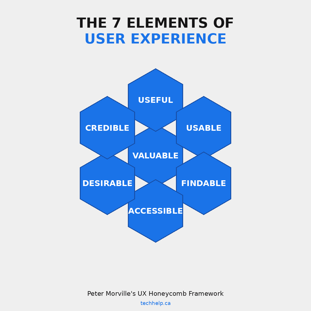
Peter Morville’s UX Honeycomb is still one of the clearest ways to explain the elements of user experience. The model describes seven qualities that work together: useful, usable, findable, accessible, desirable, credible, and valuable.
For business owners, the honeycomb is helpful because it prevents UX from becoming too narrow. A site doesn’t win because it looks good, loads fast, or has clever copy. It wins when several parts of the experience support the same user goal.
Useful
A useful website helps someone solve a problem, make a decision, compare options, complete a task, or move forward. If the content doesn’t answer the user’s question, the design can’t save it.
For a service business, useful might mean clear service descriptions, pricing context, case studies, and a contact path. For an ecommerce store, it might mean product filters, size guides, reviews, delivery details, and return policies. For a SaaS company, it might mean demos, integrations, onboarding resources, and proof that the product works for a specific use case. A useful page helps the visitor make the next decision.
Usable
Usable means people can operate the site without unnecessary effort. Buttons look clickable. Forms are easy to complete. Navigation labels are clear. Error messages explain what went wrong and how to fix it.
Usability problems often appear in places business owners rarely test: checkout, account creation, password reset, booking forms, quote request forms, and mobile menus. These are high-intent moments. If they break, the user may already be interested but unable to finish. A usable experience lets a first-time visitor complete the task without help.
Findable
Findable means users can locate the information or action they came for. Navigation, internal search, page titles, headings, filters, breadcrumbs, and content organization all affect findability.
Many websites are organized around the company’s internal structure rather than the customer’s mental model. A business may group services by department, while customers think in terms of problems. A retailer may classify products by supplier, while shoppers think by use case, size, price, or occasion. A findable experience gives customers a clear path even when they don’t already understand your business.
Accessible
Accessible means people with disabilities can use your website. This includes people who use screen readers, keyboard navigation, captions, high contrast settings, zoom, voice control, or other assistive technologies.
Accessibility is also part of web accessibility law and risk management. WCAG 2.2 is the current W3C recommendation, and many organizations still target Level AA as the practical benchmark. WebAIM’s 2026 analysis of the top one million home pages found detectable WCAG failures on 95.9% of home pages, which shows how common basic accessibility issues still are. An accessible experience doesn’t assume every user has perfect vision, perfect hearing, a mouse, or a large screen.
Desirable
Desirable means the experience feels appealing enough that people want to engage with it. Visual design, brand voice, photography, motion, layout, tone, and emotional cues all contribute.
Desirability doesn’t mean decoration. It means the experience creates the right feeling for the decision being made. A law firm should feel credible and calm. A children’s toy brand can feel playful. A cybersecurity company should feel controlled and precise. The design has to support the promise and make the offer easier to trust.
Credible
Credible UX helps users believe you. This includes testimonials, reviews, case studies, credentials, clear policies, contact information, privacy signals, transparent pricing, secure checkout, and consistent design.
Credibility also comes from removing suspicious behavior. Hidden fees, vague claims, broken links, stock-heavy pages, confusing guarantees, and aggressive popups make users hesitate. Once trust drops, users start looking for reasons not to continue. The page should answer the proof question before it asks for the action.
Valuable
Valuable means the experience works for both sides. The user gets what they came for, and the business moves closer to a meaningful outcome.
A page can be pleasant but commercially weak. A campaign can attract traffic but produce poor leads. A checkout can be attractive but slow. Effective UX supports business goals without turning the user into an obstacle.
The business case for better UX
UX pays off because it affects the full path from attention to action. It shapes whether people stay, understand, trust, compare, buy, return, and recommend.
McKinsey’s design research tracked 300 public companies over five years and found that top-quartile scorers in its McKinsey Design Index achieved 32 percentage points higher revenue growth and 56 percentage points higher total returns to shareholders than industry peers over that period. The finding wasn’t that design makes things prettier. It was that companies that measure, lead, and manage design well tend to outperform.
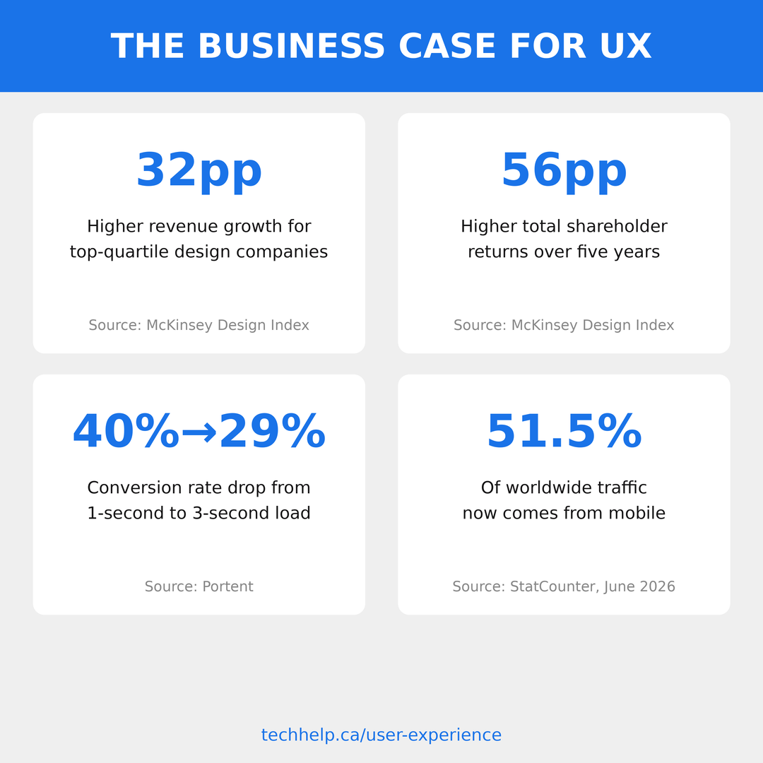
Speed data tells a similar story at page level. Portent’s site-speed research found that pages loading in one second had an average goal conversion rate close to 40%, while two-second pages dropped to 34% and three-second pages to 29%. For ecommerce, Portent found the highest conversion rates around one to two seconds, with much weaker rates as load times increased.
Mobile behavior raises the stakes. StatCounter reported that mobile accounted for 51.51% of worldwide platform share in June 2026, ahead of desktop. If your mobile experience is hard to read, slow to load, or awkward to tap through, you’re not dealing with a secondary user path. You’re dealing with a major share of your audience.
Accessibility also carries business risk. The European Accessibility Act applies to certain consumer products and services provided after June 28, 2025, including ecommerce services. In the U.S., the Department of Justice’s Title II web and mobile app rule applies to state and local governments, with compliance dates extended to 2027 and 2028 depending on entity size. Private businesses still face accessibility expectations and legal exposure under other frameworks, but the specific DOJ rule isn’t a blanket deadline for every business website.
Better UX reduces wasted traffic. If you’re paying for ads, publishing content, building SEO, or sending email campaigns, UX determines whether that attention turns into progress.
Want a UX audit for your website? Get a clearer view of what is costing users trust, time, and conversions.
Core user experience design methods
User experience design methods are structured ways to understand users, diagnose friction, test ideas, and improve the experience before you spend too much on the wrong solution.
You don’t need to run every method for every project. A small business redesign might need interviews, a content audit, a few usability tests, and a prototype. A complex SaaS product may need journey mapping, card sorting, task analysis, accessibility testing, and ongoing experimentation. The right method depends on the decision you’re trying to make.
User research
User research is how you learn what customers need, what they’re trying to accomplish, and why they behave the way they do. Without research, most UX decisions become internal opinions with nicer design language.
Start with the most immediate sources you already have: sales calls, support tickets, reviews, contact form messages, search queries, chat transcripts, and analytics. These reveal repeated questions and friction points. If customers keep asking whether you serve their industry, your positioning isn’t clear. If users search for “pricing” on your site, pricing is probably too hard to find. If support hears the same setup question every week, onboarding needs work.
Then speak with customers directly. Five to eight customer interviews can uncover patterns that analytics will never explain. The most useful interview questions are open and specific. Ask what triggered their search, what options they compared, what almost stopped them, what they needed to trust you, and what they expected to happen next.
Surveys can validate patterns at a larger scale, but they shouldn’t replace conversations. Surveys are good for measuring how often something happens. Interviews are better for understanding why.
A lean user research plan for a business website might include three steps. First, review existing data from analytics, sales, support, and search. Second, interview five customers or prospects who match your best audience. Third, turn repeated findings into design decisions: clearer page labels, better proof, revised offers, shorter forms, stronger onboarding, or new content.
User personas
Personas are fictional profiles that represent meaningful audience segments. Used well, they stop the team from designing only for themselves. Used poorly, they become decorative documents nobody reads.
A useful persona should describe goals, context, buying triggers, objections, decision criteria, and common behavior. It doesn’t need a cute name, a stock photo, or a fake biography that adds no value. For UX work, a persona is only as good as the decisions it helps you make.
For example, a business selling accounting software may serve two different users. One is a founder who wants simple invoicing and cash-flow visibility. Another is an operations manager who cares about approvals, integrations, permissions, and reporting. Both may buy the same product, but they need different proof and different page paths.
The founder needs quick clarity: what it does, how much it costs, and how fast setup is. The operations manager needs deeper evidence: workflows, controls, integrations, implementation support, and data migration. If the same page treats both people the same way, it may underserve both.
Build personas from evidence, not imagination. Use interview notes, customer data, sales feedback, and behavior patterns. Revisit them when your audience shifts.
User journey mapping
A user journey map shows the path someone takes from first awareness to completing a goal and beyond. It connects what the user is doing, thinking, feeling, and needing at each stage.
For a service business, the journey might start with a Google search, continue through a blog post, move to a service page, then a contact form, then a consultation call, then onboarding. For ecommerce, it may start with a social ad, continue through a product page, size guide, cart, checkout, confirmation email, delivery, and return or repeat purchase.
Journey mapping is valuable because it exposes handoff problems. A landing page may create interest, but the pricing page may create confusion. A product page may answer questions, but the checkout may feel risky. A sales page may promise speed, but onboarding may feel slow. Those disconnects damage trust.
When creating a journey map, don’t overcomplicate it. Use a table with stages, user questions, emotions, touchpoints, barriers, and business opportunities. The map isn’t the main work; deciding which barrier to fix first is.
Information architecture and card sorting
Information architecture is how your content is organized, labeled, and connected. It determines whether users can find what they’re looking for without learning your internal language.
Card sorting is one method for improving information architecture. In a card sort, participants organize pages, topics, products, or content items into groups that make sense to them. Nielsen Norman Group describes card sorting as a way to uncover users’ mental models and create information architecture that fits their expectations.
Use open card sorting when you don’t know how users naturally group information. Use closed card sorting when you want to test whether existing categories make sense. If you’re redesigning a service menu, ecommerce category structure, knowledge base, course library, or SaaS navigation, card sorting can save you from building a structure that only your team understands.
A small business version doesn’t need specialized software. Write your main pages or topics on sticky notes, ask several customers to group them, and listen to how they label each group. The labels users choose often reveal better navigation language than your internal terms.
After card sorting, tree testing can help validate the structure. Tree testing asks users to find information using a stripped-down menu without visual design. If people can’t find “returns” in your navigation tree, changing button colors won’t solve the problem.
Wireframing and prototyping
Wireframes are rough page layouts that show structure before visual design. They answer questions like: what appears first, what gets grouped together, where the call to action belongs, and what information the user needs before acting.
Wireframes are useful because they lower the cost of change. Moving a section in a wireframe takes minutes. Moving it after design, development, copy, and approvals can take days or weeks.
Prototypes go further by making the experience clickable. A low-fidelity prototype may be a rough set of gray boxes in Figma. A high-fidelity prototype may look close to the final site. The level of detail should match the question you’re testing. If you’re testing page flow, low fidelity is enough. If you’re testing trust, comprehension, or brand perception, higher fidelity may be needed.
Business owners should care about prototypes because they make abstract plans visible. Instead of approving a redesign based on promises, you can click through the flow, check the order of information, and test it with users before development begins.
Usability testing
Usability testing means watching people attempt tasks on your website or prototype. You observe where they succeed, where they hesitate, what they misunderstand, and what stops them.
Nielsen Norman Group’s well-known guidance is that testing with five users can reveal many usability problems when you test iteratively. The deeper lesson isn’t that five users are always enough. It’s that small, repeated tests are often more useful than one large test at the end.
For a business website, a usability test can stay lean. Ask a participant to share their screen and complete a few tasks:
Sample usability testing tasks
- Find the service that fits your situation.
- Figure out whether the company serves your location.
- Compare two pricing options.
- Book a consultation.
- Add a product to the cart and estimate delivery cost.
Ask them to think out loud. Don’t guide them. If they struggle, let the struggle happen long enough to learn from it. After the session, look for repeated patterns across users. One person getting confused may be noise. Three people getting confused in the same place is a UX issue.
A/B testing and experimentation
A/B testing compares two versions of an element or page to see which performs better. You might test a headline, CTA wording, form length, product page layout, pricing presentation, or checkout sequence.
The mistake is using A/B testing too early. If you don’t know why users are struggling, testing button colors won’t help much. Research and usability testing are better for diagnosing problems. A/B testing is better for choosing between plausible solutions once you know what you’re trying to improve.
You also need enough traffic for a test to mean anything. A low-traffic website may take too long to reach reliable results. In that case, usability testing, session recordings, analytics, and customer interviews may be better first steps.
Use A/B testing when a change affects a business outcome and you have enough visitors to measure it. Don’t use it as a substitute for understanding your users.
Heuristic evaluation
A heuristic evaluation is an expert review of a website against established usability principles. Jakob Nielsen’s 10 usability heuristics are a common reference point, covering ideas like system status, user control, consistency, error prevention, recognition over recall, and help with recovery.
For business owners, a heuristic review is useful when you need a fast diagnosis before a full redesign. It can reveal obvious problems in navigation, forms, checkout, error states, mobile layouts, and content hierarchy.
Its limitation is that experts aren’t your users. A heuristic review should guide where to look, not replace user testing. The most reliable process often combines expert review with a few usability tests.
Accessibility testing
Accessibility testing checks whether people with disabilities can use your site. It should include automated scans and manual review.
Automated tools such as WAVE, Lighthouse, and axe can flag common problems like missing alt text, contrast issues, missing labels, empty links, and heading problems. WebAIM’s 2026 report found that 96% of detected errors fell into six recurring categories, including low contrast text, missing alternative text, missing form labels, empty links, empty buttons, and missing document language. Those are fixable problems.
Manual testing is still needed because automated tools can’t understand everything. Use the keyboard to tab through key pages. Check whether focus states are visible. Test forms with a screen reader. Review captions and transcripts. Make sure error messages are specific and tied to the field that needs attention.
Accessibility work improves UX for more than disabled users. Captions help people in noisy places. Good contrast helps people in bright light. Clear labels help people rushing through a form. Keyboard access helps power users and people with temporary injuries.
Content testing
Content is part of UX. If the words are vague, the experience becomes vague.
Content testing asks whether users understand the message, know what to do next, and trust the page enough to act. You can test headlines, service descriptions, form instructions, onboarding emails, product labels, pricing explanations, and support content.
One quick method is a five-second test. Show someone a page for five seconds, hide it, and ask what the page was about, who it was for, and what action they would take next. If they can’t answer, the page is making them work too hard.
Another method is task-based comprehension testing. Ask users to find an answer on the page and explain it back. This works well for pricing, policies, product comparisons, setup steps, and service pages.
Effective content UX uses plain labels, specific headings, short paragraphs, visible next steps, and proof placed where doubt appears.
Which UX method should you use?
The right user experience design methods depend on the decision in front of you. If you’re trying to understand the problem, research methods help. If you’re trying to organize content, information architecture methods help. If you’re deciding between two viable options, testing and experimentation help.
On smaller screens, this table becomes a stacked reference view.
| Business problem | Best-fit UX methods | What the method helps you decide |
|---|---|---|
| Users don’t understand the offer | User interviews, five-second testing, content testing | What message, proof, or page structure needs to change |
| Users can’t find information | Card sorting, tree testing, navigation review | How pages, categories, labels, and menus should be organized |
| Leads or sales are weak despite traffic | Usability testing, analytics review, session recordings | Where users hesitate, abandon, or misunderstand the next step |
| A redesign is coming | Journey mapping, wireframing, prototyping, usability testing | Which flows and page structures should be validated before development |
| A form or checkout underperforms | Usability testing, form analytics, A/B testing | Which fields, errors, labels, or trust signals are creating friction |
| The team disagrees on direction | User research, heuristic evaluation, prototype testing | Which assumptions hold up when real users interact with the experience |
| Accessibility risk is high | Automated accessibility scans, keyboard testing, screen reader review | Which barriers should be fixed before they affect users or create avoidable risk |
UX principles that make or break your website
Methods help you diagnose and test. Principles help you evaluate the experience while you build.
Visual hierarchy
Visual hierarchy controls where the eye goes first, second, and third. Size, contrast, spacing, placement, imagery, and motion all influence attention.
Users scan before they read. Nielsen Norman Group’s research on the F-shaped pattern shows that people often scan text-heavy pages across the top, then down the left side, picking up headings and early words. On more visual pages, users may follow a different path, but the principle stays the same: the page has to guide attention.
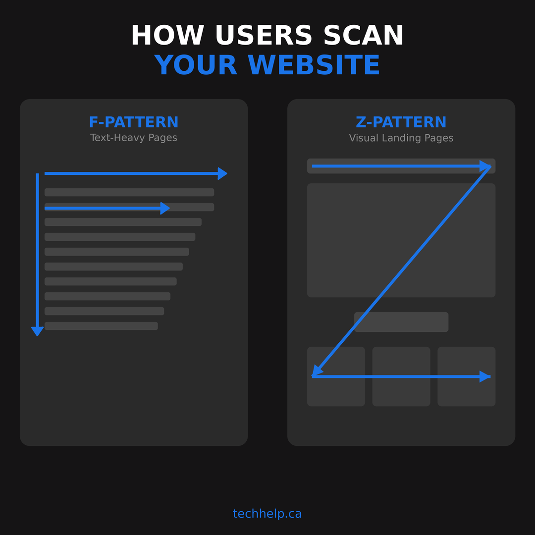
For business pages, put the most important message before the user has to hunt for it. The headline should explain the offer. The subheading should add context. The primary call to action should be visible when the user is ready, not hidden behind clutter.
If every element looks equally loud, users can’t tell what deserves attention. Clear hierarchy makes the next step feel obvious.
Navigation and site structure
Navigation should reflect how customers think, not how your company is organized.
Descriptive labels beat clever labels. “Pricing,” “Services,” “Case studies,” “Contact,” and “Book a demo” work because users know what to expect. Vague labels like “Solutions” or “Resources” can work when the site is large, but they should lead to clear subcategories.
The old “three-click rule” is less useful than people think. Users don’t mind several clicks if each click feels like progress. They do mind uncertainty. A five-step path with clear labels can feel easier than a two-step path with confusing labels.
For larger sites, search, filters, breadcrumbs, related content, and category pages become part of navigation. If users arrive from Google on an article or product page, they may never see your homepage. Every page needs to help them orient themselves.
Mobile-first and responsive design
Mobile is no longer an afterthought. With mobile holding a larger worldwide platform share than desktop in StatCounter’s June 2026 data, many users will meet your business first on a small screen.
Responsive web design means the layout adapts across screen sizes. Mobile-first design means you start with the smallest screen and add complexity as space increases. That discipline forces prioritization.
On mobile, paragraphs need to be short enough to scan. Tap targets need room. Menus need to be easy to open and close. Forms need appropriate input types. Buttons shouldn’t sit too close together. Sticky elements shouldn’t cover content. Popups need restraint.
If you’re working on mobile website design, test on actual phones, not only in a desktop browser preview. A layout that looks fine in a simulator may feel cramped in a hand.
Page speed and Core Web Vitals
Speed is part of UX because users feel delay before they understand the technical reason behind it.
Google’s Core Web Vitals focus on loading, interactivity, and visual stability. The current metrics are Largest Contentful Paint, Interaction to Next Paint, and Cumulative Layout Shift. Google recommends an LCP of 2.5 seconds or less, an INP of 200 milliseconds or less, and CLS of 0.1 or less at the 75th percentile of page loads.
Those metrics sound technical, but the user experience behind them is easy to recognize. Does the main content show up quickly? Does the page respond when the user interacts? Does the layout jump around while they try to click?
Speed problems often come from oversized images, heavy scripts, bloated themes, too many plugins, slow hosting, unused code, third-party tags, and poor caching. A website optimization pass should prioritize the templates that affect the most business value: homepage, landing pages, service pages, product pages, checkout, contact forms, and high-traffic content.
Page speed also connects to search. Google’s page experience systems don’t replace content quality, but user experience signals can influence how pages perform in search, especially when competitors offer similar value. Tech Help Canada’s guide to Google’s user experience signal covers that SEO connection in more detail.
Accessibility
Accessibility isn’t a separate project from UX. It’s a baseline for whether the experience works for more people.
Start with the basics: semantic headings, descriptive link text, alt text where images convey meaning, sufficient color contrast, keyboard navigation, visible focus states, labeled form fields, clear error messages, captions for video, and no interactions that depend only on color or mouse hover.
The most common accessibility issues aren’t rare. WebAIM’s 2026 findings show that low contrast text appeared on 83.9% of the home pages tested, missing alternative text appeared on 53.1%, and missing form input labels appeared on 51%. These are ordinary execution problems with large user impact.
For business owners, the practical lesson is to bake accessibility into every redesign, not bolt it on at the end. It’s cheaper to build accessible components once than to retrofit every page later.
Content and readability
Content user experience is how easily people can understand and act on the words on the page.
Dense blocks of text create effort. Vague headings force users to read too much before they know whether a section is relevant. Jargon creates distance. Clever copy can slow people down when clarity would convert better.
Effective content UX uses sentence case headings, specific section labels, short paragraphs, scannable structure, plain calls to action, and enough detail to answer the user’s decision questions. It doesn’t mean dumbing down the topic. It means respecting the user’s time.
For marketing user experience, content also has to match intent. A first-time visitor may need education. A comparison visitor may need proof. A returning visitor may need pricing, booking, or checkout. If every page gives the same generic pitch, the user has to do the work of translating it into their situation.
Forms and checkout
Forms are where many high-intent users disappear. A visitor may be ready to contact you, book a call, download a resource, or buy, then abandon because the form feels longer or riskier than expected.
Ask only for what you need at that stage. A newsletter signup doesn’t need a phone number. A quote form may need more context, but it should explain why each field exists. Optional fields should be clearly optional. Error messages should tell users what to fix, not just that something went wrong.
Checkout UX deserves special care. Users need to see total cost, delivery expectations, payment options, return policies, trust signals, and progress. Surprise fees, account creation requirements, unclear shipping, and broken coupon fields all create hesitation.
Effective form UX feels like a guided conversation. Weak form UX feels like paperwork.
Brand consistency
Branding and user experience meet wherever a customer tries to recognize, trust, or remember you.
Consistent colors, typography, image style, button design, page structure, and tone reduce cognitive load. When the website, emails, ads, social posts, and landing pages all feel like the same brand, users don’t have to re-evaluate trust at every touchpoint.
Consistency doesn’t mean every page looks identical. A homepage, pricing page, checkout page, and help article serve different jobs. But they should feel connected. A strong brand voice also supports UX because users learn what kind of communication to expect from you.
If a landing page feels polished but the checkout feels abandoned, the brand promise weakens. If a support article uses a different tone from your marketing, the experience feels disconnected. UX is often where brand consistency either becomes believable or falls apart.
User experience examples: what works and what doesn’t
User experience examples are useful because they make the patterns easier to see. The specific companies may change their interfaces over time, but the underlying lessons hold.
Google Search: one primary job
Google Search is a classic example of a product experience built around one primary action. The homepage gives users a search box and almost nothing else competing for attention.
The lesson isn’t that every website should be minimal. It’s that every page should know its main job. A service page should help someone understand the service and take the next step. A product page should help someone decide whether to buy. A checkout page should help someone complete payment with confidence.
When a page has too many competing goals, users have to choose where the business failed to choose.
Apple: visual explanation before technical detail
Apple product pages often lead with visual storytelling before specifications. The design shows the product in context, builds desire, and then makes technical detail available for users who want it.
The lesson is sequencing. Users don’t always need every detail first. They need the right detail at the right moment. A business selling complex services can apply the same idea: start with the outcome, show who it’s for, build trust, then provide the depth users need to evaluate.
Airbnb: exploration before commitment
Airbnb makes browsing feel low-pressure. Users can search, filter, compare photos, read reviews, and explore locations before committing. The experience supports curiosity before asking for action.
The lesson applies to many businesses. If users aren’t ready to buy, help them compare. If they aren’t ready to book, help them understand. If they aren’t ready to contact sales, give them enough proof to keep moving.
Bad UX pattern: intrusive interruptions
Popups, cookie notices, chat widgets, discount prompts, location prompts, and newsletter overlays can all serve business goals. The problem is timing and stacking.
When a visitor lands on a page and immediately gets several interruptions, the experience sends a clear message: the business wants something before the user has received value. That creates resistance.
Use interruptions sparingly. Delay them until they make sense. Make them easy to close. Never let them block a task that the user already came to complete.
Bad UX pattern: cluttered layouts
Clutter makes decision-making harder. Multiple headlines, crowded sidebars, competing buttons, excessive ads, dense navigation, and inconsistent spacing all force users to sort the page themselves.
A cluttered page may contain the right information and still fail because users can’t tell what to read first. Good UX doesn’t just add content. It creates order.
Bad UX pattern: weak error recovery
Error states are part of the experience. A form that clears all fields after one mistake, a checkout that rejects a card without guidance, or a 404 page with no path forward turns a fixable issue into frustration.
Useful error recovery explains what happened, shows what to do next, preserves user input where possible, and offers another path. This is especially valuable in forms, booking flows, checkout, account setup, password reset, and file uploads.
How to improve your website’s UX
Improved UX doesn’t always require a redesign. Many websites can improve quickly through better hierarchy, clearer labels, faster pages, shorter forms, stronger proof, and better mobile behavior.
Start with the highest-value user paths. For most businesses, that means the homepage, top landing pages, service or product pages, pricing page, contact or booking form, checkout, and onboarding flow.
Run a UX audit
A UX audit is a structured review of your website against user goals and business goals. It should identify friction, prioritize fixes, and give your team a roadmap.
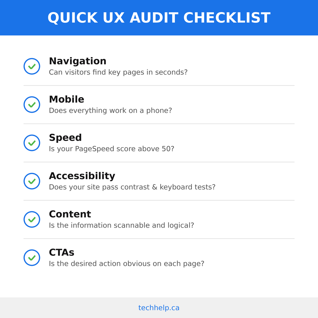
Start by choosing the top tasks users need to complete. Examples include understanding what you offer, finding pricing, booking a consultation, buying a product, comparing plans, finding support, or downloading a resource.
Then review each task path across desktop and mobile. Check whether users can understand the page quickly, find the right next step, trust the information, complete forms, and recover from mistakes.
Use this audit structure:
On smaller screens, this table becomes a stacked reference view.
| Area | What to check | What improvement looks like |
|---|---|---|
| First impression | Can users tell what you do within five seconds? | Clear headline, audience fit, and next step |
| Navigation | Can users find priority pages quickly? | Descriptive labels and fewer dead ends |
| Mobile | Can users read, tap, scroll, and complete forms easily? | Responsive layouts, tap-friendly controls, no blocking elements |
| Speed | Do priority pages load quickly and pass Core Web Vitals? | Faster templates, compressed media, fewer blocking scripts |
| Accessibility | Can users navigate by keyboard and understand content through assistive tools? | Proper labels, headings, contrast, focus states, and alt text |
| Content | Does each page answer the questions users bring to that stage? | Better headings, proof, examples, and decision support |
| Forms | Are fields necessary, labeled, and easy to complete? | Shorter forms, better errors, clearer expectations |
| Trust | Does the page reduce doubt before asking for action? | Reviews, policies, guarantees, credentials, and transparent details |
Prioritize by business impact and user pain. A confusing checkout should usually outrank a minor footer issue. A slow homepage should outrank a low-traffic archive page. A broken booking flow should outrank a cosmetic preference.
Use the right tools
Tools won’t solve UX on their own, but they help you see what users are doing.
Google Analytics 4 shows traffic patterns, conversions, drop-offs, and events. Google Search Console shows search queries, page visibility, and technical search issues. PageSpeed Insights and Lighthouse help diagnose performance and Core Web Vitals problems.
Heatmapping and session recording tools such as Hotjar, Microsoft Clarity, and Lucky Orange show scroll behavior, clicks, rage clicks, dead clicks, and recordings of user sessions. These tools are especially helpful when analytics says a page is underperforming but doesn’t explain why.
Accessibility tools such as WAVE, axe, Lighthouse, and contrast checkers can flag common issues. They won’t replace manual testing, but they help you catch problems that appear across templates.
Design and prototyping tools such as Figma, FigJam, Miro, Balsamiq, and Whimsical help teams plan structure before development. For small teams, even a whiteboard or spreadsheet can work if the thinking is clear.
The most useful tool stack is usually lean: analytics for what is happening, recordings or tests for why, and prototypes for what to try next.
Set user experience goals
User experience goals should connect user behavior to business outcomes. “Make the site better” is too vague. “Increase quote form completion from 3% to 5% without lowering lead quality” is actionable.
Common UX goals include reducing bounce rate on landing pages, increasing product page engagement, improving form completion, lowering checkout abandonment, increasing demo bookings, improving task completion, reducing support questions, and improving accessibility scores.
Match the metric to the question:
| UX question | Metric to watch |
|---|---|
| Do users understand the page quickly? | Five-second test results, bounce rate, scroll depth |
| Can users find key pages? | Navigation test success, internal search queries, path analysis |
| Can users complete the task? | Task completion rate, form completion, checkout completion |
| Are users frustrated? | Rage clicks, dead clicks, repeated field errors, support tickets |
| Is the page fast enough? | LCP, INP, CLS, load time, conversion by device |
| Is the experience accessible? | Automated issue count, keyboard test results, screen reader review |
| Does UX improve business results? | Conversion rate, qualified leads, revenue, retention, repeat visits |
Measure before you change anything. Then measure again after the change. UX improvement becomes much easier to defend when you can show what changed.
Follow a 30-day UX improvement plan
If you’re not sure where to start, use a short sprint.
collect evidence. Review analytics, top landing pages, search queries, support tickets, user recordings, and PageSpeed results. Identify the three user paths with the highest business value.
run lightweight research. Interview a few customers, run a five-second test on key pages, and ask several people to complete tasks while sharing their screen.
fix the highest-impact issues. Rewrite confusing headings, simplify navigation labels, shorten forms, compress oversized images, clarify pricing, add missing proof, improve mobile spacing, and fix obvious accessibility problems.
retest. Watch new users attempt the same tasks. Compare the metrics. Keep what improved the experience and keep working on what didn’t.
This kind of sprint won’t solve every UX issue, but it creates momentum. It also teaches your team how to make decisions from evidence instead of preference.
When to bring in a UX professional
You can handle many UX improvements yourself, especially if the problems are obvious. Bring in a UX professional when the stakes are higher or the problem is harder to diagnose.
Consider hiring help when traffic is strong but conversions are weak, customers keep asking questions your site should answer, checkout or lead forms underperform, a redesign is coming, a new product is launching, or the team can’t agree on what users need.
A capable UX professional should ask about users, business goals, constraints, data, and success metrics before talking about visual style. They should be comfortable with research, structure, testing, accessibility, content, and collaboration with designers and developers.
Avoid hiring someone who treats UX as decoration. UX work should change how the experience functions, not just how it looks.
Need help turning these methods into visible improvements? We can review the experience, prioritize the fixes, and help your team move faster.
User experience terminology glossary
Use this user experience terminology glossary as a quick reference for user experience terms that often come up when working with designers, developers, marketers, or product teams.
Common UX mistakes business owners should avoid
The same UX problems appear across industries because businesses often look at their websites from the inside out.
One common mistake is designing around internal language. Customers don’t always know your service categories, product families, or department names. Use the words customers use when they describe the problem.
Another mistake is asking for commitment too early. A first-time visitor may need proof before booking a call. A buyer may need shipping details before checkout. A prospect may need pricing context before a demo request. If the page asks before it answers, conversion suffers.
Businesses also tend to underestimate mobile friction. A desktop layout can hide problems that become obvious on a phone: long menus, tiny tap targets, sticky banners, wide tables, oversized images, and forms that are painful to complete.
Many sites bury trust signals. Reviews, guarantees, policies, case studies, certifications, contact details, and security cues should appear near the moment of doubt. A testimonial at the bottom of a page may be too late if the pricing section created hesitation halfway down.
The last mistake is treating UX as a redesign event instead of an operating habit. Your audience changes. Competitors change. Devices change. Search behavior changes. UX should be reviewed regularly, especially on pages tied to revenue, lead generation, onboarding, and support.
Build the experience around the user’s next step
Effective UX isn’t about making a website look expensive. It’s about making the next step easier to understand, trust, and complete.
The methods in this guide give you a way to do that with evidence. Research tells you what users need. Journey mapping shows where the experience breaks. Card sorting improves findability. Wireframes and prototypes reduce expensive rework. Usability testing shows where people struggle. A/B testing helps you choose between viable options. Accessibility testing ensures more people can use what you’ve built.
You don’t need to apply every method at once. Start with the path that affects revenue or trust most directly. Fix the biggest friction. Measure the result. Then move to the next path.
The businesses that win online aren’t always the ones with the flashiest designs. They’re the ones that make customers feel understood, reduce unnecessary effort, and help people finish what they came to do.
Want help making your website easier to understand, trust, and use?
Sources and references
- https://www.mckinsey.com/capabilities/tech-and-ai/our-insights/the-business-value-of-design
- https://semanticstudios.com/user_experience_design/
- https://www.nngroup.com/articles/why-you-only-need-to-test-with-5-users/
- https://www.nngroup.com/articles/card-sorting-definition/
- https://www.nngroup.com/articles/journey-mapping-101/
- https://www.nngroup.com/articles/ux-prototype-hi-lo-fidelity/
- https://www.nngroup.com/articles/f-shaped-pattern-reading-web-content/
- https://www.nngroup.com/articles/ten-usability-heuristics/
- https://webaim.org/projects/million/
- https://www.w3.org/TR/WCAG22/
- https://www.ada.gov/resources/2024-03-08-web-rule/
- https://eur-lex.europa.eu/legal-content/EN/TXT/?uri=CELEX:32019L0882
- https://portent.com/blog/analytics/research-site-speed-hurting-everyones-revenue.htm
- https://web.dev/articles/vitals
- https://gs.statcounter.com/platform-market-share/desktop-mobile-tablet/worldwide