

Your website doesn’t need a separate “phone version” to work on mobile. In most cases, it needs one strong version that adapts properly.
That’s the idea behind responsive web design. The page keeps the same URL and the same core content, then uses layout rules, flexible media, and performance decisions to fit the screen in front of the visitor.
That sounds technical, but the business impact is simple. A visitor on a phone should be able to read, tap, compare, book, buy, call, or request a quote without fighting the page.
If the desktop version looks polished but the mobile version feels cramped, slow, stripped down, or awkward to use, your website is creating friction at the exact moment many people are deciding whether to trust you.
Mobile website design is the work of removing that friction.
Mobile website design is no longer a side version
Older mobile web design often meant building a separate mobile site, usually on an m. subdomain. A desktop visitor might land on example.com, while a phone visitor might be redirected to m.example.com.
That approach made more sense when phones were less capable and desktop websites were harder to adapt. Today, it usually creates extra work and extra risk. You have more URLs to manage, more templates to maintain, more redirects to test, and more chances for the mobile version to drift away from the desktop version.
Responsive design solves the problem differently. Instead of maintaining two sites, you maintain one page that can change layout based on the visitor’s screen size, browser, input method, and device capabilities.
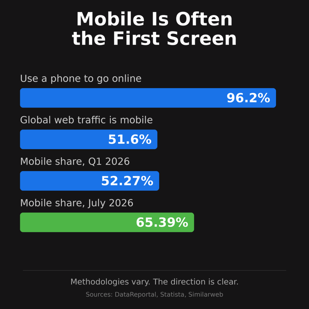
Mobile is not a small slice of web usage anymore. DataReportal’s global digital overview says 96.2% of internet users use a mobile phone to go online at least some of the time, and mobile phones account for 51.6% of global web traffic. Statista’s Q1 2026 data put mobile devices, excluding tablets, at 52.27% of worldwide website traffic. Similarweb’s July 2026 platform data put mobile even higher, at 65.39%.
The exact number changes by source, country, industry, and methodology. The practical conclusion doesn’t change: many people meet your website on a small screen first.
That affects design, search, ads, conversions, support, and trust.
What responsive web design means
Responsive web design means the same page adapts to different viewing conditions.
Google describes responsive design as a setup where the same HTML is served on the same URL regardless of device, while the display changes based on screen size. Google’s mobile-first indexing documentation also says responsive design is the easiest mobile configuration to implement and maintain.
In business terms, responsive design keeps your website easier to manage. You don’t have to publish one version for desktop and another version for mobile. You don’t have to split authority across separate URLs. You don’t have to remember to update two copies of the same page.
The same service page, product page, blog post, landing page, or contact page can serve everyone.
The layout changes. The content should not lose its value.
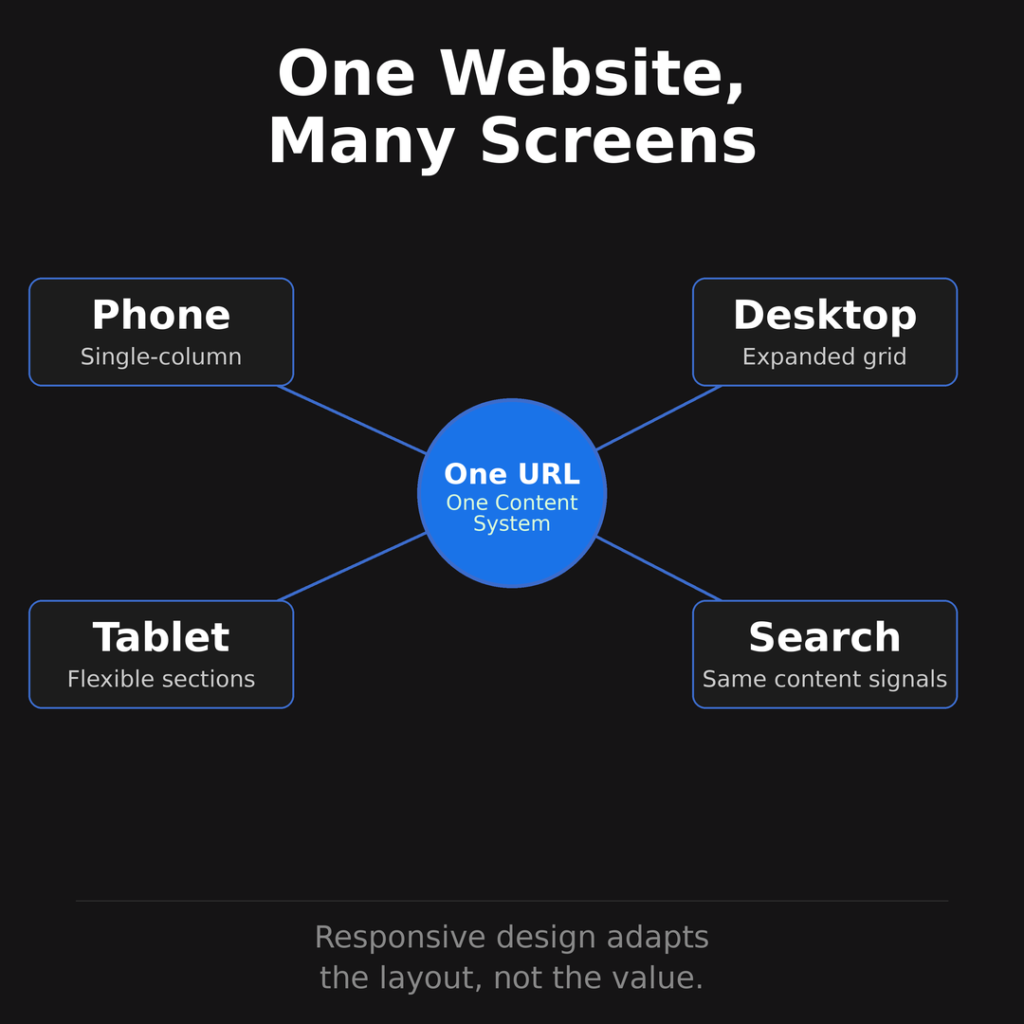
Many websites get this wrong. They make the page fit the screen, but they remove the information, proof, links, media, or calls to action that made the desktop page useful.
Responsive design is not just shrinking a desktop layout until it fits on a phone. It is designing a page system that works across different screens without making the visitor feel like they’re getting the weaker version.
Responsive design vs. dynamic serving vs. separate mobile URLs
Google recognizes three main mobile website configurations: responsive design, dynamic serving, and separate URLs.
| Mobile setup | How it works | Main tradeoff |
|---|---|---|
| Responsive design | Same URL, same HTML, layout adapts with CSS | Usually easiest to maintain |
| Dynamic serving | Same URL, different HTML based on device | More testing and server logic |
| Separate mobile URLs | Different URLs and HTML for mobile and desktop | More SEO and maintenance risk |
Responsive design is usually the best fit for small business websites, service businesses, ecommerce stores, publishers, and most content-heavy sites. It keeps the page signals together and reduces the number of moving parts.
Dynamic serving can work, but it needs careful testing. The server has to detect the device correctly, serve the right HTML, and use the right HTTP headers so crawlers and browsers understand what’s happening.
Separate mobile URLs can also work, but they are easier to mishandle. You have to maintain matching pages, redirects, canonical tags, alternate tags, structured data, metadata, links, and content parity across versions. If a desktop page redirects mobile users to the wrong mobile page, or if the mobile page contains less content, search and user experience can both suffer.
For most businesses, responsive design removes complexity instead of adding it.
How responsive web design works
Responsive design works through several layers. Each layer controls a different part of the mobile experience.
The simple version is this: the browser learns the screen size, the CSS chooses the right layout, the content flows into that layout, and the media adapts so the page stays readable and usable.
The viewport tells the browser how wide the page should be
Mobile browsers used to assume websites were built for desktop screens. To make old fixed-width pages fit, many mobile browsers rendered the page as if it were roughly desktop width, then scaled it down.
That made websites appear tiny on phones. Visitors had to pinch, zoom, and scroll sideways to read.
Responsive design starts by telling the browser to use the actual device width. The standard viewport tag looks like this:
<meta name="viewport" content="width=device-width, initial-scale=1">That small line tells the browser not to pretend the phone is a desktop monitor. It lets the page match the device width and gives the responsive layout a fair chance to work.
Without the viewport tag, even a well-designed responsive layout can behave badly on mobile.
Fluid layouts let sections resize instead of break
A responsive layout uses flexible sizing instead of fixed desktop widths everywhere.
That means columns, content areas, images, cards, navigation, and forms can resize based on the available space. A three-column desktop section might become two columns on a tablet and one column on a phone.
Good responsive design also respects reading comfort. Text shouldn’t stretch too wide on desktop, and it shouldn’t become cramped on mobile. The page needs enough spacing for fingers, enough contrast for readability, and enough structure for skimming.
The goal is not to make every screen look identical. The goal is to make every screen feel intentional.
Media queries change the layout at the right moments
Media queries are CSS rules that apply only when certain conditions are true. They can respond to viewport width, height, orientation, screen type, and other device or user preferences.
A basic media query might look like this:
@media (min-width: 768px) {
  .service-grid {
    grid-template-columns: repeat(3, 1fr);
  }
}
That tells the browser to use a three-column grid when the viewport is at least 768 pixels wide. Below that size, the layout can stay simpler.
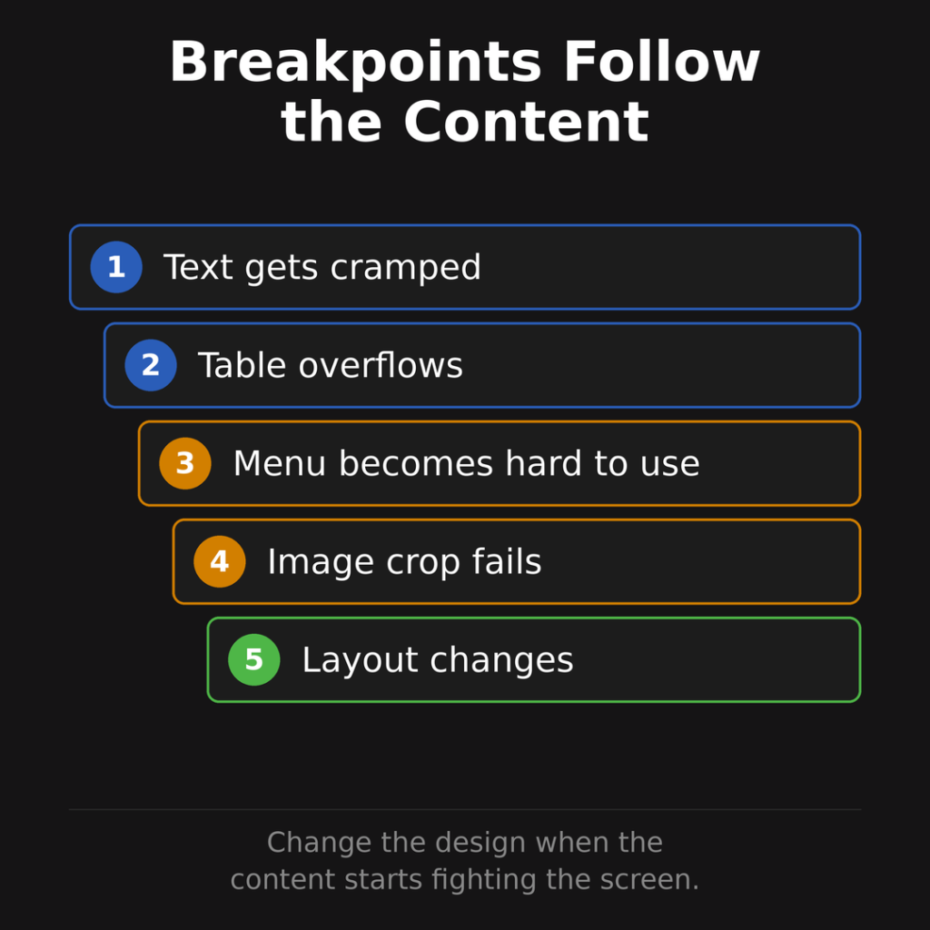
The mistake is choosing breakpoints only because a popular phone or tablet has a certain width. Devices change constantly. Content lasts longer than devices. Better responsive design chooses breakpoints based on where the content starts to feel awkward.
If a headline wraps badly at a certain width, adjust the design there. If a pricing table becomes unreadable, change the layout there. If the menu takes over the whole screen, simplify it there.
Breakpoints should follow the content.
Responsive images keep pages fast and readable
Images are often where mobile design gets expensive.
If a page sends a giant desktop image to a phone, the visitor pays for it in load time, data, battery, and patience. The image may look fine after it loads, but the page still feels slow.
Responsive images help the browser choose a better file for the visitor’s screen and context. With srcset, sizes, and sometimes the <picture> element, developers can offer different image versions so the browser can pick the most suitable one.
That affects both speed and design. A wide desktop hero image may not work well when squeezed into a narrow phone screen. Sometimes the mobile version needs a tighter crop, a different composition, or a simpler graphic.
This is one reason the old “just make the desktop image shrink” approach falls apart. Shrinking is not the same as designing.
Mobile-first content keeps the page useful
Responsive design is partly technical, but the content choices matter just as much.
On mobile, weak page structure gets exposed fast. Long introductions feel longer. Hidden contact options feel more annoying. Dense paragraphs feel heavier. Complicated forms feel less worth finishing.
A strong mobile page usually gives the visitor the answer, proof, and next step sooner. It still has depth, but it doesn’t make people work through clutter before they can act.
For a service page, that might mean a clear offer, trust signals, service details, examples, pricing context, FAQs, and a contact path that works well on a phone.
For a product page, that might mean visible product photos, price, shipping information, reviews, stock status, return details, and a checkout path that doesn’t punish thumbs.
For an article, that might mean a strong lead, useful headings, readable paragraphs, helpful visuals, and internal links that give readers a sensible next step.
If you want a deeper look at the usability side, our guide to user experience design methods connects mobile layout decisions to research, testing, content, and conversion.
Performance keeps the mobile experience from falling apart
A responsive page can still be slow.
That is why mobile website design has to include performance, not just layout. Google recommends watching Core Web Vitals, which measure loading performance, interaction responsiveness, and visual stability.
| Metric | What it measures | Good threshold |
|---|---|---|
| Largest Contentful Paint | How fast the main visible content appears | 2.5 seconds or less |
| Interaction to Next Paint | How quickly the page responds to interaction | 200 milliseconds or less |
| Cumulative Layout Shift | How stable the layout is while loading | 0.1 or less |
Those metrics are useful because they describe frustrations visitors can actually feel. The page is slow to show the main content. The menu lags after a tap. The layout jumps right as someone tries to click.
Google has also reported that 53% of visits are likely to be abandoned if mobile pages take longer than 3 seconds to load. That number is older, but the behavior behind it still tracks with how people use the web: if the page feels slow, many visitors leave before your offer gets a fair shot.
Performance work can also connect directly to revenue. A 2025 web.dev case study said T-Mobile reduced Largest Contentful Paint by 42%, cut overall website complaints by 20%, reduced slow-loading complaints by 34%, and improved prospect visit-to-order conversion rate by 60%. Another web.dev case study reported that Swappie increased mobile revenue by 42% after focusing on Core Web Vitals.
The lesson is not that every site will get those results. The lesson is that mobile performance is not just a developer scorecard. It affects whether people stay, trust, and convert.
For the SEO layer of this topic, see our guide to website page speed for SEO.
Why responsive design helps SEO
Responsive design helps SEO by reducing ambiguity.
With one URL and one HTML document, search engines have a clearer page to crawl, index, and evaluate. The same content, metadata, headings, internal links, structured data, images, and canonical signals can live in one place.
That fits Google’s mobile-first indexing model. Google announced in October 2023 that mobile-first indexing was complete. Its documentation says Google primarily uses the mobile version of a site’s content for indexing and ranking.
So the mobile version can’t be treated as a lighter companion to the desktop site. It is the version Google is likely using as the main basis for understanding the page.
Responsive design is not a ranking trick. A responsive page can still rank poorly if the content is thin, the intent is wrong, the site is slow, the page is hard to use, or the business lacks authority.
Responsive design does something more practical. It removes common technical issues that can weaken otherwise useful pages.
If search performance is the main concern, our guide to responsive website SEO goes deeper on mobile-first indexing, content parity, Core Web Vitals, and technical checks.
Mobile design mistakes that hurt search and conversions
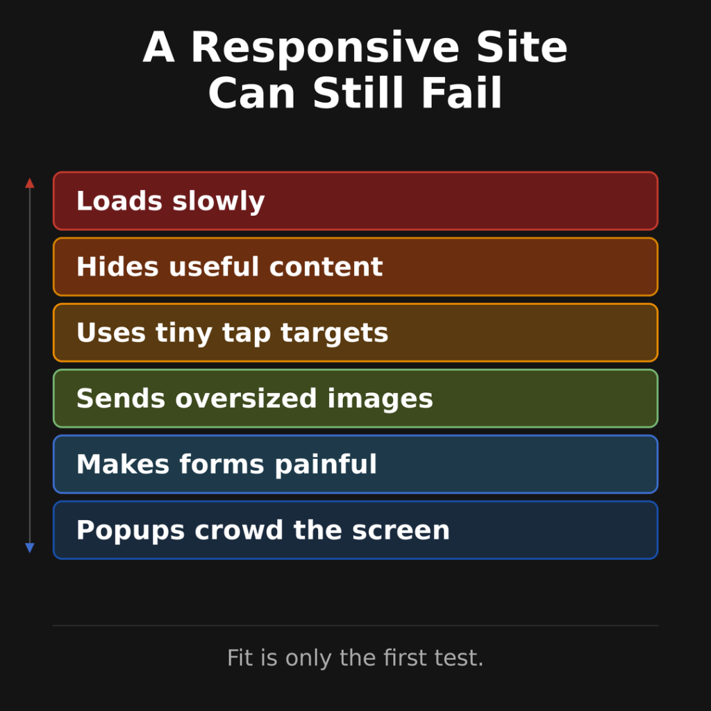
Most responsive problems are not dramatic. They are small decisions that pile up until the page feels worse on mobile than it should.
Here are the mistakes worth checking first.
| Mistake | What happens | Better choice |
|---|---|---|
| Shrinking the desktop page | Text, menus, and tables feel cramped | Rework the layout for smaller screens |
| Hiding key content on mobile | Users and search engines get less value | Keep the same useful content available |
| Loading desktop images on phones | Pages feel heavy and slow | Use responsive image sizes and formats |
| Using tiny tap targets | Buttons and links are frustrating to use | Give interactive elements enough space |
| Letting popups crowd the screen | The page feels blocked | Use restrained, easy-to-dismiss prompts |
| Ignoring mobile forms | Leads and orders drop off | Shorten fields and make inputs easy |
| Designing tables for desktop only | Visitors scroll sideways or give up | Use stacked rows, cards, or simpler tables |
| Testing only on a new phone | Problems stay hidden | Test older devices and slower connections |
The mobile version should not feel like an afterthought. If it does, the business is asking visitors to be patient in a context where they rarely are.
A practical responsive design checklist
Use this checklist when you’re reviewing an existing site or approving a redesign. It keeps the conversation focused on what the visitor can do, not just how the page looks in a mockup.
| Area | Check |
|---|---|
| Viewport | The page uses a proper viewport meta tag |
| Layout | Sections adapt without horizontal scrolling |
| Text | Body copy is readable without zooming |
| Navigation | Menus are easy to open, scan, and close |
| Tap targets | Buttons and links have enough spacing |
| Content parity | Mobile contains the same core value as desktop |
| Images | Mobile receives appropriately sized media |
| Forms | Fields, labels, errors, and submission work smoothly |
| Speed | LCP, INP, and CLS are within good ranges where possible |
| Calls to action | Contact, purchase, booking, or signup paths are obvious |
| Search | Metadata, headings, structured data, and links stay intact |
| Accessibility | Contrast, labels, keyboard access, and alt text are checked |
If you’re planning a redesign, pair this with our guide to web design trends so the site doesn’t chase visual ideas that make the mobile experience weaker.
How to tell if your website is responsive
You can start with a simple manual check.
Open your website on a phone and try to complete the main action. Don’t just look at the homepage. Try a service page, product page, article, contact page, checkout page, booking flow, and any page that gets search traffic.
Then ask:
- Can you read without zooming?
- Can you tap the right links without hitting the wrong ones?
- Can you find the main call to action quickly?
- Can you use the menu without confusion?
- Can you complete a form without fighting the keyboard?
- Does the page stay stable while loading?
- Does the mobile page include the same useful content as desktop?
That quick test won’t replace a full audit, but it will expose obvious problems.
After that, use PageSpeed Insights, Search Console, browser device previews, analytics, and physical device testing. PageSpeed Insights can show mobile performance issues. Search Console can reveal indexing, page experience, and search performance patterns. Analytics can show whether mobile visitors leave faster or convert less often than desktop visitors.
If mobile traffic suddenly drops after a redesign or technical change, our website traffic loss audit can help you work through the cause before changing too many things at once.
The best mobile website design feels invisible
Most visitors won’t compliment your responsive layout. They’ll just use it.
They’ll read the page without zooming. They’ll tap without misclicking. They’ll find the next step. They’ll open the menu and understand where to go. They’ll submit the form without giving up. They’ll compare the offer without feeling boxed in by the screen.
Good mobile website design does not make people think about the device. It helps them finish what they came to do.
Responsive web design is how you build that experience without splitting your website into separate versions. One URL. One content system. Many screen sizes. Done well, it makes your website easier to manage, easier for Google to understand, and easier for customers to use.
Frequently Asked Questions
What is mobile website design?
Mobile website design is the work of making a website easy to read, use, and act on from a phone. It covers layout, navigation, page speed, forms, tap targets, images, accessibility, and the path a visitor takes to contact you, buy, book, or keep reading.
Is responsive web design the same as mobile-friendly design?
Responsive web design is one common way to make a site mobile-friendly. A responsive site uses the same URL and core HTML, then adjusts the layout for different screen sizes. A mobile-friendly site can also use other setups, but responsive design is usually easier to maintain.
How does responsive web design work?
Responsive web design works by using a viewport tag, flexible layouts, media queries, responsive images, and mobile-aware content decisions. The browser checks the screen and device conditions, then applies the layout rules that make the page fit the available space.
Does responsive design help SEO?
Responsive design can help SEO by keeping the same content, metadata, links, and page signals on one URL. It also fits Google’s mobile-first indexing model, where the mobile version of a page is the main version used for indexing and ranking. Responsive design still needs strong content, fast performance, and a good user experience to perform well.
Are separate mobile websites still a good idea?
Separate mobile websites can still work, but they add more maintenance and SEO risk. You have to manage different URLs, redirects, metadata, structured data, internal links, and content parity. Most small business websites are better served by responsive design unless there is a specific technical reason to use another setup.
What is the viewport meta tag?
The viewport meta tag tells mobile browsers how to size and scale a page. A common responsive setup uses <meta name="viewport" content="width=device-width, initial-scale=1">, which tells the browser to match the page width to the device width instead of shrinking a desktop-sized page.
What are responsive images?
Responsive images let the browser choose an image file that fits the visitor’s screen, layout, and device conditions. This can keep mobile pages faster because phones do not need to download oversized desktop images when a smaller version would work better.
How do I know if my website is responsive?
Open key pages on a phone and try to complete the main action. If you can read without zooming, tap links easily, use the menu, complete forms, and avoid sideways scrolling, the site is likely responsive. You should also test with PageSpeed Insights, Search Console, browser previews, and physical devices.
References
- https://web.dev/articles/responsive-web-design-basics
- https://web.dev/learn/design/intro
- https://web.dev/learn/design/media-queries
- https://developer.mozilla.org/en-US/docs/Learn/HTML/Multimedia_and_embedding/Responsive_images
- https://developer.mozilla.org/en-US/docs/Web/HTML/Reference/Elements/picture
- https://developers.google.com/search/blog/2023/10/mobile-first-is-here
- https://developers.google.com/search/docs/crawling-indexing/mobile/mobile-sites-mobile-first-indexing
- https://developers.google.com/search/docs/appearance/core-web-vitals
- https://support.google.com/adsense/answer/7450973
- https://datareportal.com/global-digital-overview
- https://www.statista.com/statistics/277125/share-of-website-traffic-coming-from-mobile-devices/
- https://www.similarweb.com/platforms/
- https://web.dev/case-studies/t-mobile-case-study
- https://web.dev/case-studies/swappie

I can suggest related Tech Help Canada articles based on the topic you’re reading now.

We empower people to succeed through practical business information and essential services.